This blog that Ive found is full of interesting and random items, just incredible, check it out.
http://welikethisstuff.blogspot.com/
Sunday 18 December 2011
Wednesday 14 December 2011
Bruno Mars
Continuing to develop ideas we have now decided on a style for our campaign, which has been heavily inspired by Erika Simmons, I haven't been able to upload our designs onto here yet, but you will see a similarity to Simmons work in our poster designs. I have uploaded this music video of Bruno Mars - Just the way you are, as it contains a moving motion images of cassette tape art, which could be a idea for if we decide to design a projection film for Alight.
Wednesday 7 December 2011
Erika Simmons
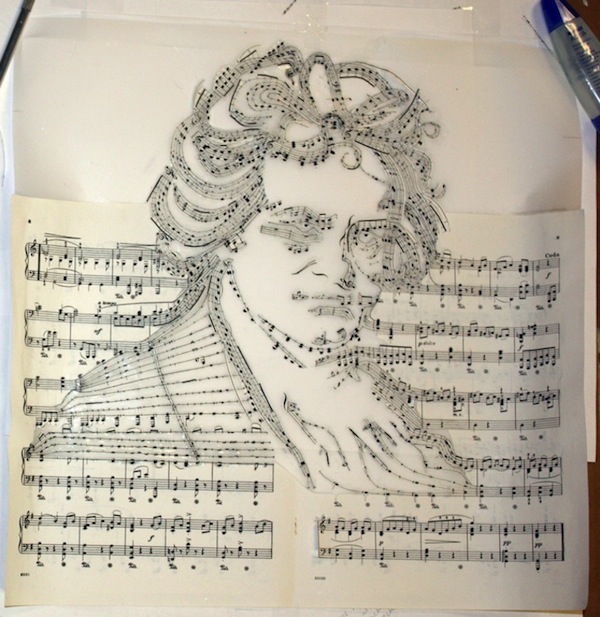
While developing on my current Uni project 'Alight' I came across Erika Simmons who is an imaginative painter and sculptor who is driven by an incredible passion for self-expression through art. Her works are often noted for their unique and innovative styles that focuses on recycling found materials, such as old cassettes and used books. One of her most famous and popular items of art are from the series ' Ghost in the machine'. The following images are simply amazing..


Simmons achieves these simple designs though cutting up and re arranging pieces and items of everyday life, when asked about where her ideas come from she mentions the philosopher Gilbert Ryle, who describes how your spirt lives in your body. I love the quote Simmons gave ' I Imagine we are like cassettes - thoughts wrapped up in awkward packages'. Some of Simmons other work is just simply beautiful I love the way she uses music note sheets into art, i have found this website that takes you through step by step on how Simmons produced this style.
http://www.mymodernmet.com/profiles/blogs/beethoven-made-of-his-own-musical-notes
http://www.iri5.com/

Tuesday 29 November 2011
Saturday 26 November 2011
Examples of Advertising..
While in London, I took some examples of different ways and techniques to advertise..


While walking around London there were also many posters for the 2012 olympic games..


Friday 25 November 2011
London Town ♥

Our London trip was amazing, on the first night we went out to a few bars in Soho, bit of shock when we found out a double was 10 quid, jeezeeeee, but we still had a excellent night. The next day we got split into two groups and went to different agencies that Mel had set up, The first one me Zara went to was Rapier, I was so excited. It took us a while to find their office, but once we were in it was crazy, they had a nice slick and cool space that they worked in. It seemed homely, they had a kitchen area where we could just help ourselves to drinks, they were very friendly. We got given a small brief that we had to go away an work on, It was one of their real life briefs for their new account RAC. We sat in pizza hut for about 4 hours no joke, just trying to crack on with some ideas, it was all rather rushed but exciting. We knew that Rapier wouldn't like all of our quick ideas but we hoped they would give us good critical feedback, which is exactly what we got. The y were so helpful in telling and showing us what they were looking for in new designers. They said that all we need to do was be able to show our ideas for campaigns in one sentence with a series of simple black markered ideas. It was scary presenting our ideas to top blokes at one of the most respected agencies but it was helpful in so many ways. Its made us more excited and focused on what we want. The advice they gave us was to never give up, they said we wouldn't be handed a job on a plate but that we had to work hard and get driven for it. It was good to also casually talk to previous Sheffield Hallam students who now worked for Rapier, I felt they were very inspiring.
The next day we all had a guest talk at the design group Inferno, where Paul spoke to us about how he got into the agency, projects they were working on, information about the young creatives council. He was such a cool guy, very laid back and chilled out about everything. He showed us some of infernos campaigns one of my favourites was their work for Kiss Fm.

Paul also mentioned about the Young Creative Council, which Inferno work very closely with and informed us on how we could be involved in it too, most of us had never heard of them before but now I
regularly have a peek on their website. Its nice to just see what other designers from all over are creating. Every couple of days people upload their pieces of work for others to see, some pieces are truly beautiful.
http://www.youngcreativecouncil.com/
He also spoke about there campaign work with Nokia, he showed us the tv advert they had produced for the new Nokia Lumia phone.The amazing everyday Campaign was developed by Infernos executive creative director Al Young and was filmed by director Jeff Thomas. Young and Thomas trawled through thousands of YouTube clips and became astonished by how people make the most of their individuality. Thomas shot the advert over four days in LA with 20 scenes making it into the final cut. When asked about their ad campaign Thomas and Jeff said “We blurred the line between fiction and reality,” Al Young agrees, “but we could never lose touch with the humanity. The humanity of amazing everyday experiences is essential, because we we wanted to get across that this phone, the Nokia Lumia, can turn your life into an adventure.” Take a look at it..
Sunday 20 November 2011
Lannndaannnn
Actually so excited for tomorrow, i cant wait to get involved in some amazing agencies, also the shopping is calling my name too. Im most excited to go and visit Rapier as they are the UK's fastest growing design agency. They have also just won the £7 million account with RAC and the £6 Million account for Travelodge. How amazing!
Saturday 19 November 2011
You know its christmas...
We all know its getting close to christmas when the John Lewis, Marks and Sparks and Coco Cola adverts make it onto our screens. Coco Cola are defiantly the forward runners on this idea, every year more and more people get excited to see their christmas ads, which are always classic, they never really seem to change basic idea which is great, thats why people like me love seeing it every year. When ever i first see the ad on the screen i instantly know i have to start my christmas shopping as christmas is soon coming, No matter what age you are the coco-cola ad will always get you excited for christmas holidays.
I normally love the coco-cola advert the most every christmas, no other ad ever really compares to it, but i have to say this christmas my favourite advert has to be John Lewis i think its brilliant. This year they wanted to bring to life the feeling of excitement and anticipation you get when you've brought the perfect gift and cant wait for christmas to arrive. This advert follows a little boy who is impatiently counting down the days to christmas, you are led to believe through the whole advert that he cant wait to open his own gifts, but we only discover in the final seconds of the advert that he was only willing time on to move faster so he could finally give his perfectly wrapped gift to his parents. Its amazing. 'For gifts you can wait to give' ends the advert perfectly.
Wednesday 16 November 2011
Amazing Ads
Feeling a bit woolly-headed?
I love this ad, it amuses me everytime. I think the strapline is amazing, the way they have made the main character out of wool links the strapline together into the ad in a superb way.
Monday 14 November 2011
Client Briefing
This morning we got given a lecture by the Client, who delivered exactly what she wanted us to produce for this brief. She didn't give much detail, or any exact requirements apart from what had to be shown on the posters or flyers. I feel rather confused after this talk with the Client, as she hasn't given us much to go on, she has left it quite open.
Questions we asked..
- Budget restrictions?
- Media restrictions / requirements?
- Any Mandatories?
Things we need to remember and include..
- Logo and Brand needs to resemble 'Alight'
- Arts Council logo has to be shown
- Tagline if needed
- Unite Arise and Alight could also be used
- Colours need to be kept low due to low budget
- Flyers should target different audiences
- Yorkshire based
- Its a community event -> Multi cultural
- Date, Web address, the three segments, tagline, 'Alight' all need to shown on poster
Target Audiences?
DAYLIGHT -> General Public
TWILIGHT -> Friends / Family of performers
INTO THE NIGHT -> Secondary Schools / Students / Family and Friends
Unite = Coming together
Arise = The rise of popularity / Involvement
Alight = The name of the festival / everything coming together / Alighting the community
There is a lot to think about after this lecture, to start with ive researched into what represents the city, looked at the different venues for the different sectors, looked into existing music festivals like V fest, Creamfields and Glastonbury. Ive also started mocking up some general ideas and straplines which can be seen in my sketchbook.
By next week me and Zara need to have strated to think about what our 5 part campaign will consist of and what we want it to achieve.
Wednesday 9 November 2011
New Brief - Alight
We have just been given the new professional practice brief which is with a live client, who will give their requirements and feedback on our work and ideas. This brief will give us the opportunity to get involved with a real life project and also the chance for our ideas to be chosen by the client and used for the Alight event in March. The client in charge of the event planning will be coming to give us a lecture sometime this week to inform us what they are expecting and requiring. To start with i need to look into what the event is, whose behind it and what it will consist of to give me some background information.
So what is Alight?! - A festival based in Sheffield that is in conjunction with the Music Nation and The London 2012 Cultural Olympiad which is the largest cultural celebration in the history of the modern Olympic and Paralympic Movements. Alight will be part of the countdown for the final Olympiad event London 2012 Festival .The festival will give the chance for everyone to celebrate London 2012 through dance, music, theatre, the visual arts, film and digital innovation, and leave a lasting legacy for the arts in the UK.

So what is Alight?! - A festival based in Sheffield that is in conjunction with the Music Nation and The London 2012 Cultural Olympiad which is the largest cultural celebration in the history of the modern Olympic and Paralympic Movements. Alight will be part of the countdown for the final Olympiad event London 2012 Festival .The festival will give the chance for everyone to celebrate London 2012 through dance, music, theatre, the visual arts, film and digital innovation, and leave a lasting legacy for the arts in the UK.
Tuesday 8 November 2011
Evaluation
I havent blogged for a while, ive been getting caught up in the sketch book. Today we shall be finishing the last of our final designs ready for the presentation tomorrow. Im feeling confident in our work, but also just a bit nervous on having to pitch our idea to the tutors.
I feel that me and Zara have done well on producing what we wanted to, which was a fun campaign that captured a reverse outlook on the basic ideas. Im very happy with the outcome of our final sketches. We have looked into a variety of campaign ideas. The "i am not a de-icer " campaign could be taken further that what we took it, the idea could easily be widened and expanded in many ways.
I feel that me and Zara have done well on producing what we wanted to, which was a fun campaign that captured a reverse outlook on the basic ideas. Im very happy with the outcome of our final sketches. We have looked into a variety of campaign ideas. The "i am not a de-icer " campaign could be taken further that what we took it, the idea could easily be widened and expanded in many ways.
Friday 4 November 2011
Action Plan
Well my first plan of action should probably be that i should get more organised, as i have left this action plan quite late into the project!
In this second year of my course i hope to be achieving at least 60% on most briefs, and always developing on my knowledge of advertising. I want this second year to open up a whole load of opportunities for me, Im excited for the London trip that will show me what its like being in a agency.
The main areas i need to work on to achieve my goals are -
-time keeping
-being organised
-always generating ideas
Im still not to sure on what area of advertising i would like to venture into, but this first brief has defiantly proved to me that i am on the right specialism as im enjoying the brief.
Tuesday 1 November 2011
Social Media- FACEBOOK
We cant lie now, everyone loves a little bit of facebook. The social media site has gone from strength to strength. Many advertising agecies are using facebook to promote up and coming products. Many ads also use facebook to get users involved with the campaigns.
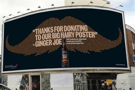
The newest online facebook ad i have found is one for Ginger Joe Kicks Beer. I found this example in a issue of Campaign magazine.
The alcoholic ginger beer brand has just stepped up its campaign investing a whooping 2million into the new ads. It has created outdoor press and online ads. The ads were designed by DHM. The first billboard featured a giant hairy moustache and a QR code, taking mobile users to the ginger joe facebook page , where they could use an app to give themselves a ginger moustache. when users go to the page they could also win one of 20,000 free bottles of ginger joe beer.
Another great facebook ad is from Shreddies campaign, where facebook users could help them to conduct their search for new 'nanas'.

Cadburys and Nandos are now both jumping on the band wagon, by allowing users to upload either their voice or their Nandos noise. which would feature in their new ads. Nandos have said that the winner of the Nandos Noise will receive Free Nandos for a whole year!
Friday 28 October 2011
Apps
Im not going to lie, i am a blackberry lover, i dont own a iphone, so i cant say that i get the whole app hype, but i do think they are pretty cool.
So what is a App?!
"Its an application, a piece of software. An app can be on the internet, on a computer or on a phone."
We have decided on a app for part of our campaign as more and more people are using them, for hundreds of reasons. The point of or app is just for fun, to simply melt the ice box in a quick time using a whole range of different tools, like hair dryer, salt, credit card, red hot chillies, hot girls, bums, iron ect. The scores of everyone that plays will be kept and the winner with the fastest time will receive a cash priz of some sort.
The style of our app will be similar to that of the Talking Tom Cat App which responds to your touch and repeats everything you say in a funny voice, you can pet him, poke him or grab him.
Tuesday 25 October 2011
Kopparberg
We have been running with the idea of anything related to heat, we have been creating some basic design layouts for the posters, which we will be teasers, and shown before the tv ad is shown.
Ive been researching teaser adverts and have come across this great example from Saint@RKCR/Y&R, for the new Kopparberg ad which is "Find Kopparberg. This campaign was designed to be discovered, its an invitation to go beyond the mainstream and be rewarded for it. Kopparberg didn't just want its drinkers to see the campaign but they wanted them to live it and use social media as a key element to spread the word. The brand already has a solid fan base of 11,000 people on facebook, but kopparberg wanted to engage the audience further with a wider social media platform and host incredible real world events such as; gatekepper events for industry staff, underground sponsorships and the Kopparberg Klash which is a series of 5 competitive events celebrating alternative music and photography in partnership with VICE magazine.
I think the whole build up of this Campaign is just amazing, the teaser adverts dont give anything away.
Once they had published the teaser ads they then leaked the real advert that explains everything..
Friday 21 October 2011
Development
We started to look at basic ideas of how people clean the ice off their windows instead of using the de-icer, we thought of the standard answers for example credit card and kettle. Then we thought of random items or activities that would get rid of ice, like for example, a hair dryer, warm air, heater and the sun to add a twist. After speaking to mel, we discussed a whole range of random items that could be used, we spoke about making the ad more open to fun ideas that consumers would never think of. Again ive done the word association process and have come up with random items that all link to warming ice up, or creating heat. some of our favourites are ones like a babys bum, which could be squashed up again the window screen, which would create heat, people having sex in a car, that would steam up the car causing the ice to melt, chillie sauce, Lightbulb, Hot girls- gives the impression of heat, a tongue to lick away the ice. The possibilities are endless.
Wednesday 19 October 2011
Media
Media ideas that could be used for the Campaign ->
-Adverts
-Posters
-Magazine Ads
-Web page
-Web banners
-bus shelter
-Side of bus
-Flyer
-Ice Sculpture
-Facebook
-Apps
-Freebie give out
-Cardboard Cut outs
-Newspaper
The final 5 Campaign areas we are developing are as followed..
1 Magazine Ad
2 Billboards
1 TV Ad
1 I phone App
-Adverts
-Posters
-Magazine Ads
-Web page
-Web banners
-bus shelter
-Side of bus
-Flyer
-Ice Sculpture
-Apps
-Freebie give out
-Cardboard Cut outs
-Newspaper
The final 5 Campaign areas we are developing are as followed..
1 Magazine Ad
2 Billboards
1 TV Ad
1 I phone App
Tuesday 18 October 2011
Straplines
I had a gander at the reading list we were given last week, Ive taken 4 of them out to help me create a interesting ad campaign for de-icer.
-hey whipple, squeeze this, by Luke Sullivan
-The fundamentals of creative advertising, by Ken Burtenshaw
-Guerrilla Advertising, by Gavin Lucas
-Creative Advertising by Mario Pricken
While looking through Mario Pricken's book I came across a list of areas in which a ad campaign could fall into.
-Compare and contrast (before/after)
-Repetition and accumulation
-Exaggeration
-Turn it around -> Doing the opposite of what people expect/surprise.
-Omission and suggestion -> the fact of some information missing means the consumer gets involved, forcing them to play an active role, sometimes this is unaware from a consumers point of view.
-Paradoxes and optical illusions
-Provocation and shock tactics.
So far in this project we have just been creating general ideas for the ad, we now need to open up into one area. We have chosen our three most strongest ideas which we pitched in front of the class today, we also had to start thinking of straplines or headlines.
Hear are Some examples of good strong straplines..


The ideas we currently have are..
-SHOCKING
> "Spray now.. your life depends on it"
> "De-Die"
> "One spray is all we need"
-FUN
>"The Blue star effect"
very similar to the Lynx Effect, aimed at young males/boy racers
PLAYFUL/TURN IT AROUND
>"I am not a de-icer"
Converting the obvious.
The rest of the group agreed that the 'I am not a de-icer' was the best campaign to run with. There are so many options to expand with this campaign. We now need to develop this idea into a five part campaign, which must consist a range of media use.
-hey whipple, squeeze this, by Luke Sullivan
-The fundamentals of creative advertising, by Ken Burtenshaw
-Guerrilla Advertising, by Gavin Lucas
-Creative Advertising by Mario Pricken
While looking through Mario Pricken's book I came across a list of areas in which a ad campaign could fall into.
-Compare and contrast (before/after)
-Repetition and accumulation
-Exaggeration
-Turn it around -> Doing the opposite of what people expect/surprise.
-Omission and suggestion -> the fact of some information missing means the consumer gets involved, forcing them to play an active role, sometimes this is unaware from a consumers point of view.
-Paradoxes and optical illusions
-Provocation and shock tactics.
So far in this project we have just been creating general ideas for the ad, we now need to open up into one area. We have chosen our three most strongest ideas which we pitched in front of the class today, we also had to start thinking of straplines or headlines.
Hear are Some examples of good strong straplines..
The ideas we currently have are..
-SHOCKING
> "Spray now.. your life depends on it"
> "De-Die"
> "One spray is all we need"
-FUN
>"The Blue star effect"
very similar to the Lynx Effect, aimed at young males/boy racers
PLAYFUL/TURN IT AROUND
>"I am not a de-icer"
Converting the obvious.
The rest of the group agreed that the 'I am not a de-icer' was the best campaign to run with. There are so many options to expand with this campaign. We now need to develop this idea into a five part campaign, which must consist a range of media use.
Sunday 16 October 2011
Amazing Ads


While searching online for amazing adverts i came across the website http://www.webdesigncore.com/2010/04/17/23-inspirational-exceptional-print-ads/
which was just amazing, it had all sorts of ads shown on the page, these are just some of my favourites that i have seen..


This Evian ad is one of my favourites, I love the tv ad with the running babies that are rolling around on rollarskates, i find it hilarious, its ad that people will remember for a long time. Ive never seen any of the print work for this campaign before, until now. The ad is very simple which works well, the concept of the advert is that everyone is young, and has a childish side, this poster shows this well. You can see the message they are trying to capture very easily. This needs to be a key factor in our de-icer campaign. we need the message to be clear.


Wednesday 12 October 2011
Workshop One
Im feeling much more confident with this project now, after the first lesson. I felt like for once i had gained some knowledge, maybe its because Im actually interested in this lesson. Mel made us do basic black marker ideas on another random product - Locktight super glue. This was to get our ideas and processes flowing, she also introduced us to the wonderful technique of word association .. i was given a list of items and words in which i had to think of at least 30 other words that were linked or associated with the original word.. this boring method actually does work, i came up with a load of words that could be used to developed into actual campaign ides. She told us to use this ideas method for the De-icer brief which me and Zara did. In my sketch book you can see the 2 page list of words associated with De-icer. From this we started to create little thumbnails of images which could be used for the final posters. overall we created a whole load of basic sketch designs for our de-icer product with the help of the words association list.
Monday 10 October 2011
Specialism - Advertising
The specialism I have picked for the duration of my course at Sheffield Hallam is advertising. It was hard for me to choose between just general Graphics and Advertising, but I felt I wanted to be more direct with my choice of field rather than being very general in everything. Ever since studying Graphics at college I have always had a passion for advertising, I have a inspiration book in which consists of anything that inspires me or i find interesting, its hard to now use blogger as my inspiration book, but ill have to just get used to it!
We have just been given our first specialism project of level 5, we have been told to work in groups of two which I like, It makes a change to working alone all the time it also gives a chance to bounce ideas off each other it and double the ideas. The product we have to design a campaign for is Blue Star De-icer. My first thought of this is.... RANDOM or what. To be honest not many ideas are running though my head at the moment.
We have just been given our first specialism project of level 5, we have been told to work in groups of two which I like, It makes a change to working alone all the time it also gives a chance to bounce ideas off each other it and double the ideas. The product we have to design a campaign for is Blue Star De-icer. My first thought of this is.... RANDOM or what. To be honest not many ideas are running though my head at the moment.
Thursday 5 May 2011
Final Animation
I am very happy with my animation outcome. I didn't feel to confident at the the start of the brief and was a little apprehensive on how my final animation would come out like. If i had longer i would have added more of an actual story, and possibly characters. This has made me more interested in animation and the different types you can develop like cell animation for example. Some parts of my design have changed if you look back on my storyboard but the main concept has remained the same, i still feel my 3 words still come through on the animation. Overall i feel i have achieved the best i could for this brief.
Music Editing
Now i had my completed animation under 30 seconds i needed to edit my piece of audio which was simpler than i expected. I downloaded again another free trial of wave pad, which allowed me to cut and snip my music down to the time i needed for my animation. I cut my music to 25 seconds then imported the final audio piece into I movie and overlapped the frames and the music.

 Edited Piece.
Original Piece


Sunday 1 May 2011
..
Once i had uploaded all my images into I photo i imported each frame to I movie where i was able to adjust the frame time to 0.2seconds per frame, the only down side to using I movie is that the frame rates can only be 0.1, 0.2 then 0.4 (ect). 0.2 seconds works well for my animation but i would have been happier if i could have selected 0.25seconds instead, as i felt the my audio was to slow for my images.

Thursday 28 April 2011
I photo & I movie
After my workshop in the stop motion suite i was keen to use the same technique as i wanted a rough and jolty look to my animation. I downloaded a free trial of 'I can Animate' But i couldn't use my digital camera when it was connected to my mac therefore there was no live camera running though the program so i had to think of a different program to use. I decided to use I photo and I movie together as they would work in sync and be easy to use. I took all my frames individually on my camera then imported each one into I photo to start with and produced a sequence of images that built up to form my animation.


Wednesday 20 April 2011
making the 'set'
To be honest I hadn't really thought about my background set at all, when i developed my storyboard I just wanted a simple block coloured or textured background instead of anything to fancy or like an actual scene, as I felt it wasn't necessary due to me not having any characters. Here you can see I painted a number of individual rice grains in a mixed variety of colours. Just like in my storyboard I wanted to keep the bright colours but felt after my 10% assessment I felt I needed to re-think my idea slightly as skittles didn't fit into the mexican/spanish music genre. Here are some examples of different textures and backgrounds. I feel image 1 & 2 work well as they provide some movement in the background but not to over powering, whereas the background image 5 is far to bright for the feel of my stop motion animation.


Monday 11 April 2011


Subscribe to:
Posts (Atom)